
mcp allows missing values (NA) in the
response. This article covers two consequences of that:
- Change points in voids: Change points can be inferred in regions with no observed responses.
-
Imputing missing responses: JAGS treats the missing
responses as latent variables and samples them together with the model
parameters. You can inspect expected responses with
fitted()and the imputation distribution withpredict().
Inferring change points in voids
Sometimes the interest is not in recovering individual missing
responses, but in how gaps in the data affect inference about the change
points. To demonstrate this, mcp_example("void") takes the
data from mcp_example("demo") and sets the responses near
both change points to NA (25 < time < 42
and 70 < time < 80). The top panel shows the fit to
the full data and the bottom panel the fit with the voids:
fit_void = mcp_example("void", sample = "both")## NA values detected in 'response'. JAGS will treat them as latent responses and impute them during sampling.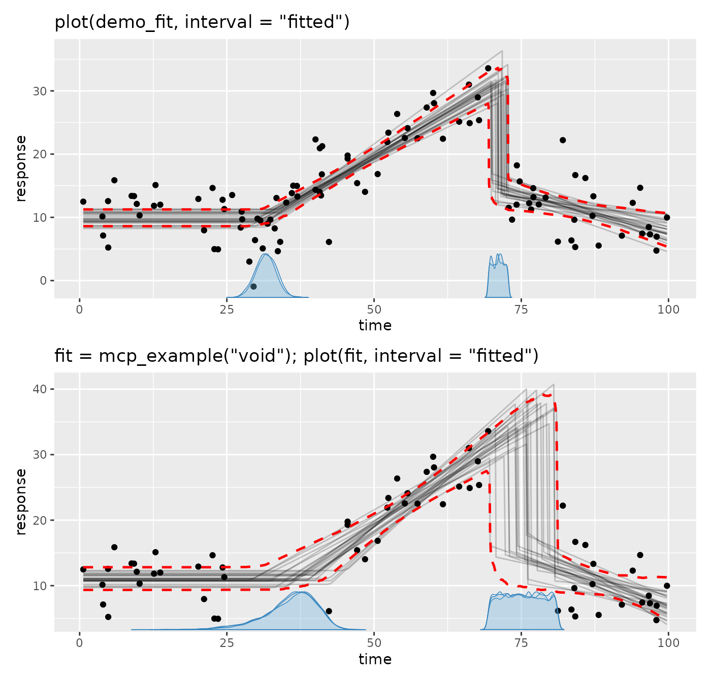
The message confirms that mcp detected the missing
responses.
Notice that mcp can infer change points in regions with
no observed data. The first change point joins a plateau to a slope. Its
location in the void is mostly informed by extrapolating the two
segments until they meet, and the uncertainty is greater than in the
full data because fewer data inform these trends. In principle, it could
be known to great precision if the segments’ trends were very well
defined.
The second change point is different because segment 3 is disjoined from segment 2. There is nothing in the void that tells where the jump happened, so the change point posterior is roughly uniform across the void. This is true for any gap between data: the narrow gap between two neighboring data points (top panel) also yields a uniform-like posterior, just on a much smaller range.
We can quantify how much of each change point posterior is within its
void using hypothesis(). Because we sampled the prior too
(sample = "both"), it also returns a Bayes factor
(BF) for each interval, i.e., how much the data shifted the
odds of the change point being in the void:
hypothesis(fit_void, c(
  "cp_1 > 25 & cp_1 < 42",
  "cp_2 > 70 & cp_2 < 80"
))
## # A tibble: 2 × 7
## hypothesis mean sd lower upper prob BF
## <chr> <dbl> <dbl> <dbl> <dbl> <dbl> <dbl>
## 1 cp_1 > 25 & cp_1 < 42 NA NA NA NA 0.935 46.6
## 2 cp_2 > 70 & cp_2 < 80 NA NA NA NA 0.840 28.3Imputing missing responses
An example with missing responses
The built-in example has a change in slope, a strong difference between two states, scattered missing responses, and a short run of missing responses:
fit = mcp_example("missing")## NA values detected in 'y'. JAGS will treat them as latent responses and impute them during sampling.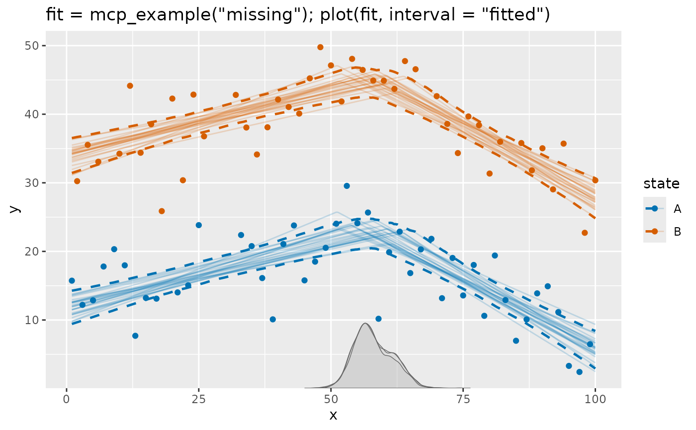
The ordinary plot shows the observed responses and model estimates
but omits missing responses. Below, we add them to the plot.
These are the rows with missing responses in y:
##     y  x state
## 1  NA  8     B
## 2  NA 19     A
## 3  NA 27     A
## 4  NA 28     B
## 5  NA 29     A
## 6  NA 30     B
## 7  NA 31     A
## 8  NA 68     B
## 9  NA 84     B
## 10 NA 96     B
Expected responses and predictions
predict() evaluates the posterior predictive
distribution at the missing rows, generating fresh simulated responses
that include residual variation. The predictions come from trends in
non-missing data and what they imply, given the observed covariates
(state and x), for the missing rows. Without
ar() or ma() terms, as here, these predictions
have the same distribution as the JAGS imputations, so we use them as
imputations below.
# Mean and 80% posterior predictive interval for missing data
imputed = predict(fit, width = 0.8) |>
  filter(is.na(y))
imputed
## # A tibble: 10 × 7
## y x state .mean .sd .lower .upper
## <dbl> <int> <fct> <dbl> <dbl> <dbl> <dbl>
## 1 NA 8 B 35.4 4.41 29.8 41.0
## 2 NA 19 A 15.5 4.35 9.95 21.1
## 3 NA 27 A 17.1 4.34 11.6 22.6
## 4 NA 28 B 39.4 4.34 33.8 44.9
## 5 NA 29 A 17.5 4.34 12.0 23.0
## 6 NA 30 B 39.8 4.34 34.2 45.3
## 7 NA 31 A 17.9 4.34 12.4 23.4
## 8 NA 68 B 41.3 4.44 35.6 46.9
## 9 NA 84 B 34.6 4.36 29.0 40.1
## 10 NA 96 B 29.5 4.46 23.9 35.2fitted() has the same syntax as predict()
but returns the posterior expected response. Its intervals are
narrower because they do not include response variation:
# Mean and 80% posterior interval of the expected response at missing data
fitted(fit, width = 0.8) |>
  filter(is.na(y))
## # A tibble: 10 × 7
## y x state .mean .sd .lower .upper
## <dbl> <int> <fct> <dbl> <dbl> <dbl> <dbl>
## 1 NA 8 B 35.4 1.08 34.0 36.8
## 2 NA 19 A 15.5 0.832 14.4 16.6
## 3 NA 27 A 17.1 0.761 16.1 18.1
## 4 NA 28 B 39.4 0.760 38.4 40.3
## 5 NA 29 A 17.5 0.761 16.5 18.5
## 6 NA 30 B 39.8 0.762 38.8 40.7
## 7 NA 31 A 17.9 0.768 16.9 18.9
## 8 NA 68 B 41.3 1.20 39.8 42.9
## 9 NA 84 B 34.6 0.890 33.4 35.7
## 10 NA 96 B 29.5 1.28 27.9 31.2Visualizing imputations
Imputations are not added to plot() automatically. Since
plot() returns a ggplot, it is easy to extend. Here an
× marks the posterior mean and a vertical line shows the
central 80% imputation interval:
# Start with mcp plot with prediction interval
plot(fit, color_by = "state", interval = "predict", width = 0.8) +

  # Add imputation interval
  geom_linerange(
    data = imputed,
    aes(x = x, ymin = .lower, ymax = .upper),
    inherit.aes = FALSE,
    color = "black"
  ) +

  # Add "x" at posterior mean
  geom_point(
    data = imputed,
    aes(x = x, y = .mean),
    inherit.aes = FALSE,
    shape = 4,  # an "x"
    size = 2
  )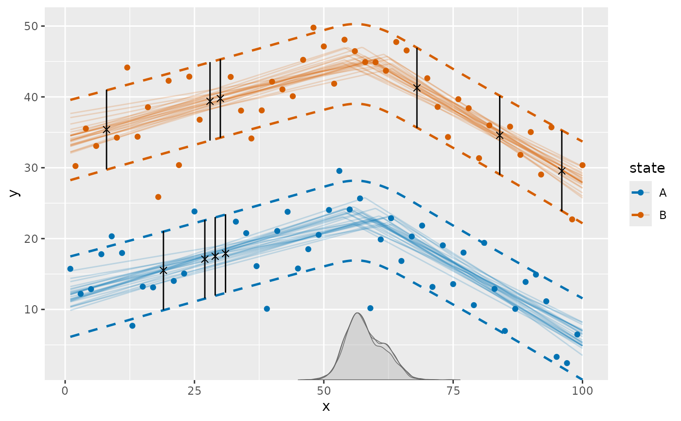
This deliberately distinguishes imputed values from the solid
observed points. You can change the interval width, marker, color, or
add a subset of the missing rows using ordinary dplyr and
ggplot2 code.
The plot above reduces each imputation distribution to an interval.
Use summary = FALSE when you need the individual draws
instead. Here we plot the imputation distribution for each missing
row:
missing_draws = predict(fit, summary = FALSE) |>
  filter(is.na(y))

ggplot(missing_draws, aes(x = .prediction)) +
  geom_density() +
  facet_wrap(~x)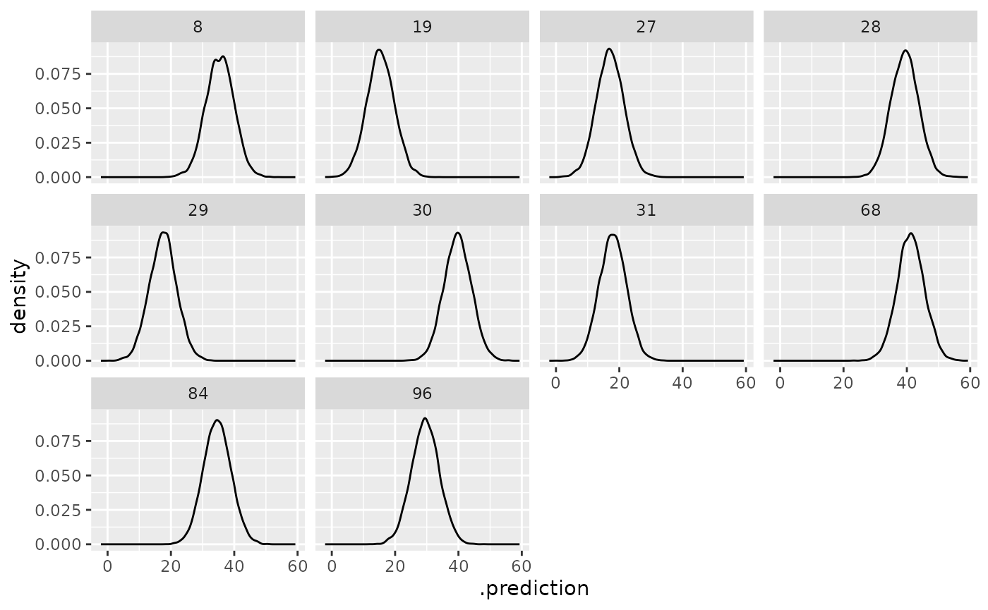
Probabilistic statements about missing responses
Sometimes, the missing response is of direct interest. For example,
you may want to know the probability that a missing response is above a
threshold. You can use predict() with
summary = FALSE to get all posterior predictive draws and
then calculate probabilities of various statements. For example:
missing_draws |>
  filter(.row == 19) |>  # Row number 19 in original data
  summarise(
    p_greater = mean(.prediction > 20),
    p_lower = mean(.prediction < 10),
    p_between = mean(.prediction > 10 & .prediction < 20)
  )
## # A tibble: 1 × 3
## p_greater p_lower p_between
## <dbl> <dbl> <dbl>
## 1 0.146 0.105 0.749Imputations and other continuous predictors
Plotting differs from fitted() and
predict() in one respect: The smooth curves in
plot() are evaluated on data made by
interpolate_newdata(), which keeps additional continuous
predictors (i.e., predictors not assigned an aesthetic) at their
observed means by default, or at values supplied through the
at-argument. The plot caption reports these fixed values.
See the plotting article for
using interpolate_newdata() to make your own plots.
The imputation markers above are different: predict(fit)
evaluates the original data, so every missing row uses its own predictor
values. If another continuous predictor is especially important, an
imputation may therefore lie away from a curve drawn at that predictor’s
mean. This is expected, just as an observed response with unusual
predictor values may lie away from that curve. Use
plot(fit, at = ...) or
interpolate_newdata(fit, at = ...) or make separate plots
when those differences deserve emphasis.
Supported models and limitations
Supported model features
Missing responses work with the usual mcp model
features. For example, you can:
- Include continuous and categorical predictors so imputations follow observed covariate information.
- Use group-level effects so sparsely observed groups borrow information from the population and their available observations.
-
Model changing residual standard
deviation with
sigma()so imputation uncertainty can vary over the predictor range. - Use binomial, Bernoulli, Poisson, or negative-binomial responses. Their imputations remain on the appropriate discrete response scale; binomial predictions can also be returned as rates.
The predictors required by the model must themselves be observed.
mcp currently imputes missing responses, not missing
predictor values, and it does not model the process that caused
responses to be missing. As with ordinary regression using incomplete
outcomes, interpretation relies on the missing responses being
reasonably explained by the observed predictors and model structure.
Model evaluation and time series
Missing rows are not treated as observed contributions to
log_lik(), loo(), or waic(). For
ordinary non-AR/MA models, the remaining observed rows can still be used
for these calculations.
AR/MA models need extra care because a missing response can become
part of the history for later observations. mcp retains the
JAGS draws so fitted() and predict() can
reconstruct that history, but it does not currently integrate over
missing histories for pointwise likelihood calculations. Consequently,
log_lik(), loo(), and waic() are
unavailable when a missing response precedes some observed data.
The time-series article discusses
this. Use predict(fit, arma = "replicate") or
posterior_predict(fit, arma = "replicate") to generate
fresh replicated series recursively. Their histories are generated
rather than taken from the observed responses. The default predictions
condition on observed responses and retained imputations as histories,
but still generate fresh outcomes at every row.
Predictions for new data
In AR/MA models, the retained JAGS draws belong to the missing rows in the original fitted data and supply their histories. For the non-AR/MA example in this article, predictions for genuinely new data are ordinary posterior predictions, evaluated just like predictions at the missing rows:
newdata = data.frame(
  x = c(20, 80),
  state = factor(c("A", "B"), levels = levels(fit$data$state))
)

predict(fit, newdata = newdata, width = 0.8)
## # A tibble: 2 × 6
## x state .mean .sd .lower .upper
## <dbl> <fct> <dbl> <dbl> <dbl> <dbl>
## 1 20 A 15.7 4.35 10.2 21.3
## 2 80 B 36.3 4.36 30.7 41.8